QCARDS ASSESSMENT TOOL
QCARDS ASSESSMENT TOOL
Qcards is a self-help emotional assessment platform built on a proprietary "Emotional Map.: A language model derived from over 60,000 structured interviews and multidimensional-scaling research into how people describe feeling, personality, values, and behavior. Users sort a deck of 128 emotion cards, see where they land on an interactive 3D map across eight positive/negative zone pairs, and receive a personalized report covering their emotional "superpower," blind spots, risk zones, and balance across ten scored indicators. I joined as design consultant during the platform's Beta phase, working alongside the founder and a backend engineer to take the product from a functional MVP to a polished, coherent, ship-ready experience.

BUSINESS CHALLENGE
BUSINESS CHALLENGE
Most people can tell you what they're feeling in the moment, but not why or what to do about it. Emotions get pushed aside, misread, or left unexamined, and without a clear picture of their own emotional patterns, people struggle to spot what's driving their stress, where their real strengths lie, or how to move toward better well-being. Existing options are polarized: pop-psychology quizzes that are fun but unrigorous, or clinical/therapeutic tools that are expensive, slow, and gatekept by professionals. Qcards fills that gap a self-help "Inner GPS" grounded in over a decade of behavioral-science research (60,000+ interviews, multidimensional-scaling methodology) but delivered as an accessible, low-friction card-sorting assessment anyone can take in minutes, for free, without a diagnosis, a therapist, or a paywall standing between them and understanding themselves.
Most people can tell you what they're feeling in the moment, but not why or what to do about it. Emotions get pushed aside, misread, or left unexamined, and without a clear picture of their own emotional patterns, people struggle to spot what's driving their stress, where their real strengths lie, or how to move toward better well-being. Existing options are polarized: pop-psychology quizzes that are fun but unrigorous, or clinical/therapeutic tools that are expensive, slow, and gatekept by professionals. Qcards fills that gap a self-help "Inner GPS" grounded in over a decade of behavioral-science research (60,000+ interviews, multidimensional-scaling methodology) but delivered as an accessible, low-friction card-sorting assessment anyone can take in minutes, for free, without a diagnosis, a therapist, or a paywall standing between them and understanding themselves.
BUSINESS CHALLENGE
Most people can tell you what they're feeling in the moment, but not why or what to do about it. Emotions get pushed aside, misread, or left unexamined, and without a clear picture of their own emotional patterns, people struggle to spot what's driving their stress, where their real strengths lie, or how to move toward better well-being. Existing options are polarized: pop-psychology quizzes that are fun but unrigorous, or clinical/therapeutic tools that are expensive, slow, and gatekept by professionals. Qcards fills that gap a self-help "Inner GPS" grounded in over a decade of behavioral-science research (60,000+ interviews, multidimensional-scaling methodology) but delivered as an accessible, low-friction card-sorting assessment anyone can take in minutes, for free, without a diagnosis, a therapist, or a paywall standing between them and understanding themselves.
USER RESEARCH & INSIGHTS
USER RESEARCH & INSIGHTS
I didn't run the underlying psychometric research, that's the founding team's decade-plus body of work with Q.i. Value Systems but a core part of my job was translating it faithfully into UI. That meant treating the existing PRD as a primary source: cross-referencing zone-map word placements against the original assessment-map PDF at the geometry level (extracting true coordinates via PyMuPDF rather than eyeballing screenshots) when two card labels turned out to be genuinely mispositioned, and verifying that report copy like the Flo score ratio and Teeter Totter verdicts matched the underlying scoring logic exactly rather than approximating it. The recurring insight: in a data-dense self-assessment product, small UI decisions label font size, a result's visual weight, whether a number reads as "the headline" or "a footnote" directly determine whether users trust and act on their results.
I didn't run the underlying psychometric research, that's the founding team's decade-plus body of work with Q.i. Value Systems but a core part of my job was translating it faithfully into UI. That meant treating the existing PRD as a primary source: cross-referencing zone-map word placements against the original assessment-map PDF at the geometry level (extracting true coordinates via PyMuPDF rather than eyeballing screenshots) when two card labels turned out to be genuinely mispositioned, and verifying that report copy like the Flo score ratio and Teeter Totter verdicts matched the underlying scoring logic exactly rather than approximating it. The recurring insight: in a data-dense self-assessment product, small UI decisions label font size, a result's visual weight, whether a number reads as "the headline" or "a footnote" directly determine whether users trust and act on their results.
USER RESEARCH & INSIGHTS
I didn't run the underlying psychometric research, that's the founding team's decade-plus body of work with Q.i. Value Systems but a core part of my job was translating it faithfully into UI. That meant treating the existing PRD as a primary source: cross-referencing zone-map word placements against the original assessment-map PDF at the geometry level (extracting true coordinates via PyMuPDF rather than eyeballing screenshots) when two card labels turned out to be genuinely mispositioned, and verifying that report copy like the Flo score ratio and Teeter Totter verdicts matched the underlying scoring logic exactly rather than approximating it. The recurring insight: in a data-dense self-assessment product, small UI decisions label font size, a result's visual weight, whether a number reads as "the headline" or "a footnote" directly determine whether users trust and act on their results.
STRATEGY & DESIGN RATIONALE
STRATEGY & DESIGN RATIONALE
The project began as a physical artifact, not a screen. Qcards started life as a printed deck of 128 emotion cards paired with a two-sided Mind Map you laid out by hand, the result of years of interview based research into how people actually describe what they feel. That physical ritual, sorting cards, placing them on a map, seeing your emotional world take shape in front of you, became the thing the digital product had to earn the right to replace. My approach was to treat the deck as the source of truth for the interface, not just its inspiration: the card sort became the onboarding flow, the printed Mind Map became the interactive 3D emotional map, and the manual's plain, encouraging voice became the site's tone of copy. Every screen I touched got measured against one question, does this feel as direct and tactile as flipping through the real cards, or does it feel like software standing between the user and their own answer. Where the product's rigor was already proven on paper, my job was translation, not invention: keep the emotional map's zone colors and structure intact, let the results read like a physical readout rather than a data dashboard, and resist the pull toward generic app conventions that would have flattened what made the original deck work in the first place.
The project began as a physical artifact, not a screen. Qcards started life as a printed deck of 128 emotion cards paired with a two-sided Mind Map you laid out by hand, the result of years of interview based research into how people actually describe what they feel. That physical ritual, sorting cards, placing them on a map, seeing your emotional world take shape in front of you, became the thing the digital product had to earn the right to replace. My approach was to treat the deck as the source of truth for the interface, not just its inspiration: the card sort became the onboarding flow, the printed Mind Map became the interactive 3D emotional map, and the manual's plain, encouraging voice became the site's tone of copy. Every screen I touched got measured against one question, does this feel as direct and tactile as flipping through the real cards, or does it feel like software standing between the user and their own answer. Where the product's rigor was already proven on paper, my job was translation, not invention: keep the emotional map's zone colors and structure intact, let the results read like a physical readout rather than a data dashboard, and resist the pull toward generic app conventions that would have flattened what made the original deck work in the first place.
STRATEGY & DESIGN RATIONALE
The project began as a physical artifact, not a screen. Qcards started life as a printed deck of 128 emotion cards paired with a two-sided Mind Map you laid out by hand, the result of years of interview based research into how people actually describe what they feel. That physical ritual, sorting cards, placing them on a map, seeing your emotional world take shape in front of you, became the thing the digital product had to earn the right to replace. My approach was to treat the deck as the source of truth for the interface, not just its inspiration: the card sort became the onboarding flow, the printed Mind Map became the interactive 3D emotional map, and the manual's plain, encouraging voice became the site's tone of copy. Every screen I touched got measured against one question, does this feel as direct and tactile as flipping through the real cards, or does it feel like software standing between the user and their own answer. Where the product's rigor was already proven on paper, my job was translation, not invention: keep the emotional map's zone colors and structure intact, let the results read like a physical readout rather than a data dashboard, and resist the pull toward generic app conventions that would have flattened what made the original deck work in the first place.

PROCESS & ITERATION
PROCESS & ITERATION
Work moved in tight, verifiable loops: change code, load the actual dev server, click through the real flow (seeding test assessment answers via a dev-only tool built for this purpose), screenshot the result, adjust. For the Teeter Totter redesign specifically, that meant a first pass at a bold 52px label size, discovering it collided at the map's actual display width, and dialing back to 36px once I'd verified spacing against the smallest real container the component renders in, not the largest. For the emotional-map label legibility fix, I traced the actual root cause (a CSS rule targeting classes that no <text>element in the SVG actually used dead styling, not a sizing choice) rather than patching the symptom.
Work moved in tight, verifiable loops: change code, load the actual dev server, click through the real flow (seeding test assessment answers via a dev-only tool built for this purpose), screenshot the result, adjust. For the Teeter Totter redesign specifically, that meant a first pass at a bold 52px label size, discovering it collided at the map's actual display width, and dialing back to 36px once I'd verified spacing against the smallest real container the component renders in, not the largest. For the emotional-map label legibility fix, I traced the actual root cause (a CSS rule targeting classes that no <text>element in the SVG actually used dead styling, not a sizing choice) rather than patching the symptom.
PROCESS & ITERATION
Work moved in tight, verifiable loops: change code, load the actual dev server, click through the real flow (seeding test assessment answers via a dev-only tool built for this purpose), screenshot the result, adjust. For the Teeter Totter redesign specifically, that meant a first pass at a bold 52px label size, discovering it collided at the map's actual display width, and dialing back to 36px once I'd verified spacing against the smallest real container the component renders in, not the largest. For the emotional-map label legibility fix, I traced the actual root cause (a CSS rule targeting classes that no <text>element in the SVG actually used dead styling, not a sizing choice) rather than patching the symptom.
COLLABORATION & LEADERSHIP
COLLABORATION & LEADERSHIP
I worked in parallel with a backend engineer on a shared feature branch, which meant merge conflicts were routine, not exceptional — before every push, fetch and merge first, verify the type-checker still passes clean, then ship. When I discovered that some live production content (homepage hero copy, a testimonial block) existed nowhere in git history, deployed once directly from someone's local machine and never committed. I didn't just patch around it; I reconstructed the missing pieces faithfully from the live DOM and flagged the process gap explicitly so it wouldn't recur. Every non-trivial change went out through the same disciplined loop: local verification, commit, push, deploy, confirm live.
I worked in parallel with a backend engineer on a shared feature branch, which meant merge conflicts were routine, not exceptional — before every push, fetch and merge first, verify the type-checker still passes clean, then ship. When I discovered that some live production content (homepage hero copy, a testimonial block) existed nowhere in git history, deployed once directly from someone's local machine and never committed. I didn't just patch around it; I reconstructed the missing pieces faithfully from the live DOM and flagged the process gap explicitly so it wouldn't recur. Every non-trivial change went out through the same disciplined loop: local verification, commit, push, deploy, confirm live.
COLLABORATION & LEADERSHIP
I worked in parallel with a backend engineer on a shared feature branch, which meant merge conflicts were routine, not exceptional — before every push, fetch and merge first, verify the type-checker still passes clean, then ship. When I discovered that some live production content (homepage hero copy, a testimonial block) existed nowhere in git history, deployed once directly from someone's local machine and never committed. I didn't just patch around it; I reconstructed the missing pieces faithfully from the live DOM and flagged the process gap explicitly so it wouldn't recur. Every non-trivial change went out through the same disciplined loop: local verification, commit, push, deploy, confirm live.
CONSTRAINTS & PROBLEM SOLVING
CONSTRAINTS & PROBLEM SOLVING
The environment had real teeth: no design tooling beyond code and a browser, video and image assets arriving as multi-megabyte source files that had to be transcoded (ffmpeg, pngquant) and verified for quality loss before they could ship, and a Firebase Hosting CDN layer that caches long enough that "deployed" and "live" are genuinely two different states every deploy required an explicit CDN flush, not just a Cloud Run push. Local development itself broke at one point on missing Google Cloud credentials; rather than work around it by hand each session, I fixed the underlying code so it degrades gracefully without real credentials, permanently unblocking local dev for the whole team.
The environment had real teeth: no design tooling beyond code and a browser, video and image assets arriving as multi-megabyte source files that had to be transcoded (ffmpeg, pngquant) and verified for quality loss before they could ship, and a Firebase Hosting CDN layer that caches long enough that "deployed" and "live" are genuinely two different states every deploy required an explicit CDN flush, not just a Cloud Run push. Local development itself broke at one point on missing Google Cloud credentials; rather than work around it by hand each session, I fixed the underlying code so it degrades gracefully without real credentials, permanently unblocking local dev for the whole team.
CONSTRAINTS & PROBLEM SOLVING
The environment had real teeth: no design tooling beyond code and a browser, video and image assets arriving as multi-megabyte source files that had to be transcoded (ffmpeg, pngquant) and verified for quality loss before they could ship, and a Firebase Hosting CDN layer that caches long enough that "deployed" and "live" are genuinely two different states every deploy required an explicit CDN flush, not just a Cloud Run push. Local development itself broke at one point on missing Google Cloud credentials; rather than work around it by hand each session, I fixed the underlying code so it degrades gracefully without real credentials, permanently unblocking local dev for the whole team.
FINAL SOLUTION
FINAL SOLUTION
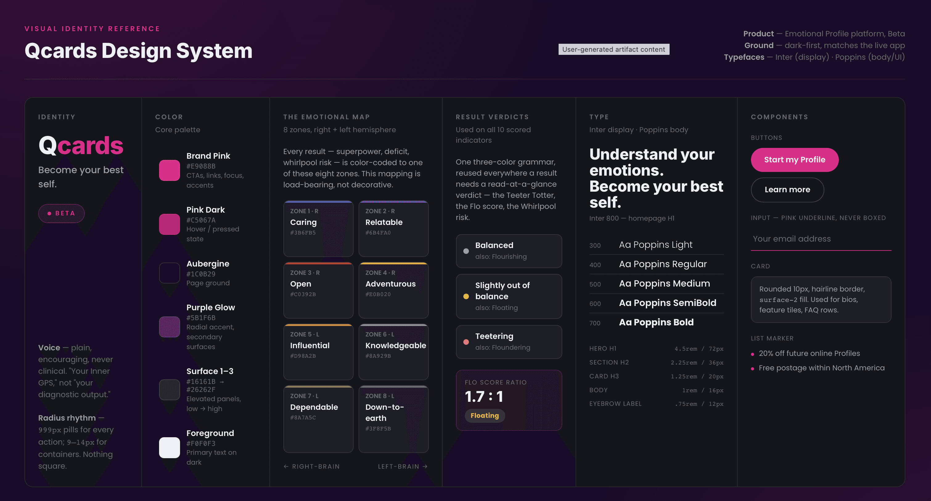
A cohesive, production-deployed experience: a navigation system that scales cleanly from mobile to desktop, a store with real photography and video for every product, result screens that visually match the seriousness of the science behind them, and a fully corrected, geometrically-verified emotional map. Every change shipped through the same pipeline Cloud Run plus a Firebase Hosting CDN flush and is live at qcards.com today.
A cohesive, production-deployed experience: a navigation system that scales cleanly from mobile to desktop, a store with real photography and video for every product, result screens that visually match the seriousness of the science behind them, and a fully corrected, geometrically-verified emotional map. Every change shipped through the same pipeline Cloud Run plus a Firebase Hosting CDN flush and is live at qcards.com today.
FINAL SOLUTION
A cohesive, production-deployed experience: a navigation system that scales cleanly from mobile to desktop, a store with real photography and video for every product, result screens that visually match the seriousness of the science behind them, and a fully corrected, geometrically-verified emotional map. Every change shipped through the same pipeline Cloud Run plus a Firebase Hosting CDN flush and is live at qcards.com today.
OUTCOMES & METRICS
OUTCOMES & METRICS
As a Beta-stage product, the meaningful outcomes were structural rather than top-of-funnel: a navigation pattern that no longer breaks as the site grows, a store page with three visually distinct products instead of one repeated photo, ten scored result indicators now visually consistent with each other, and a documented, repeatable deploy process the whole team follows. Concrete before/after: report result cards went from plain paragraph text to highlighted stat cards; the Teeter Totter axes went from static bars to branded, glowing indicator cards; zone-map label text went from functionally illegible to fully readable at both natural and embedded display sizes.
As a Beta-stage product, the meaningful outcomes were structural rather than top-of-funnel: a navigation pattern that no longer breaks as the site grows, a store page with three visually distinct products instead of one repeated photo, ten scored result indicators now visually consistent with each other, and a documented, repeatable deploy process the whole team follows. Concrete before/after: report result cards went from plain paragraph text to highlighted stat cards; the Teeter Totter axes went from static bars to branded, glowing indicator cards; zone-map label text went from functionally illegible to fully readable at both natural and embedded display sizes.
OUTCOMES & METRICS
As a Beta-stage product, the meaningful outcomes were structural rather than top-of-funnel: a navigation pattern that no longer breaks as the site grows, a store page with three visually distinct products instead of one repeated photo, ten scored result indicators now visually consistent with each other, and a documented, repeatable deploy process the whole team follows. Concrete before/after: report result cards went from plain paragraph text to highlighted stat cards; the Teeter Totter axes went from static bars to branded, glowing indicator cards; zone-map label text went from functionally illegible to fully readable at both natural and embedded display sizes.
KEY LEARNINGS
KEY LEARNINGS
The biggest lesson wasn't visual, it was procedural. In a small team shipping fast, the gap between "committed" and "deployed" is where real content quietly gets lost, and the fix isn't more caution, it's tighter verification: always diff against what's actually live, not just what's in the branch. The second: when a product's credibility rests on real research, design's job isn't to decorate the output, it's to get out of its way, the redesigned result cards work because they let the number be the interface, not because they're more "designed."
The biggest lesson wasn't visual, it was procedural. In a small team shipping fast, the gap between "committed" and "deployed" is where real content quietly gets lost, and the fix isn't more caution, it's tighter verification: always diff against what's actually live, not just what's in the branch. The second: when a product's credibility rests on real research, design's job isn't to decorate the output, it's to get out of its way, the redesigned result cards work because they let the number be the interface, not because they're more "designed."
KEY LEARNINGS
The biggest lesson wasn't visual, it was procedural. In a small team shipping fast, the gap between "committed" and "deployed" is where real content quietly gets lost, and the fix isn't more caution, it's tighter verification: always diff against what's actually live, not just what's in the branch. The second: when a product's credibility rests on real research, design's job isn't to decorate the output, it's to get out of its way, the redesigned result cards work because they let the number be the interface, not because they're more "designed."
©2026 CARLOS RUBIO DESIGN
GO BACK TO TOP
©2026 CARLOS RUBIO DESIGN
GO BACK TO TOP